I’ve never met Adger Cowans. But I’ve listened to him talk. About life, about art, about the sea, about struggle, about his mother, and about the intoxication of being. In an age of personalities, Adger is a mind. (I think he would say, spirit, unanchored, wayfaring.) Just read one or two interviews online. The thing you’ll notice is that the questions can begin anywhere—hometown life in Columbus, Ohio, photography classes with Clarence White, Jr., racism in the sixties, Life Magazine, or Gordon Parks—anywhere, and like an aikido master, Adger will redirect toward topics less incidental and more toward (in his words) the Great Wah Wah.


For Adger, they don’t have much staying power—the incidentals of the world. It’s like Wordsworth said, “The world is too much with us; late and soon,” but Adger says, Look, water! Look, sun! Do you see it?!


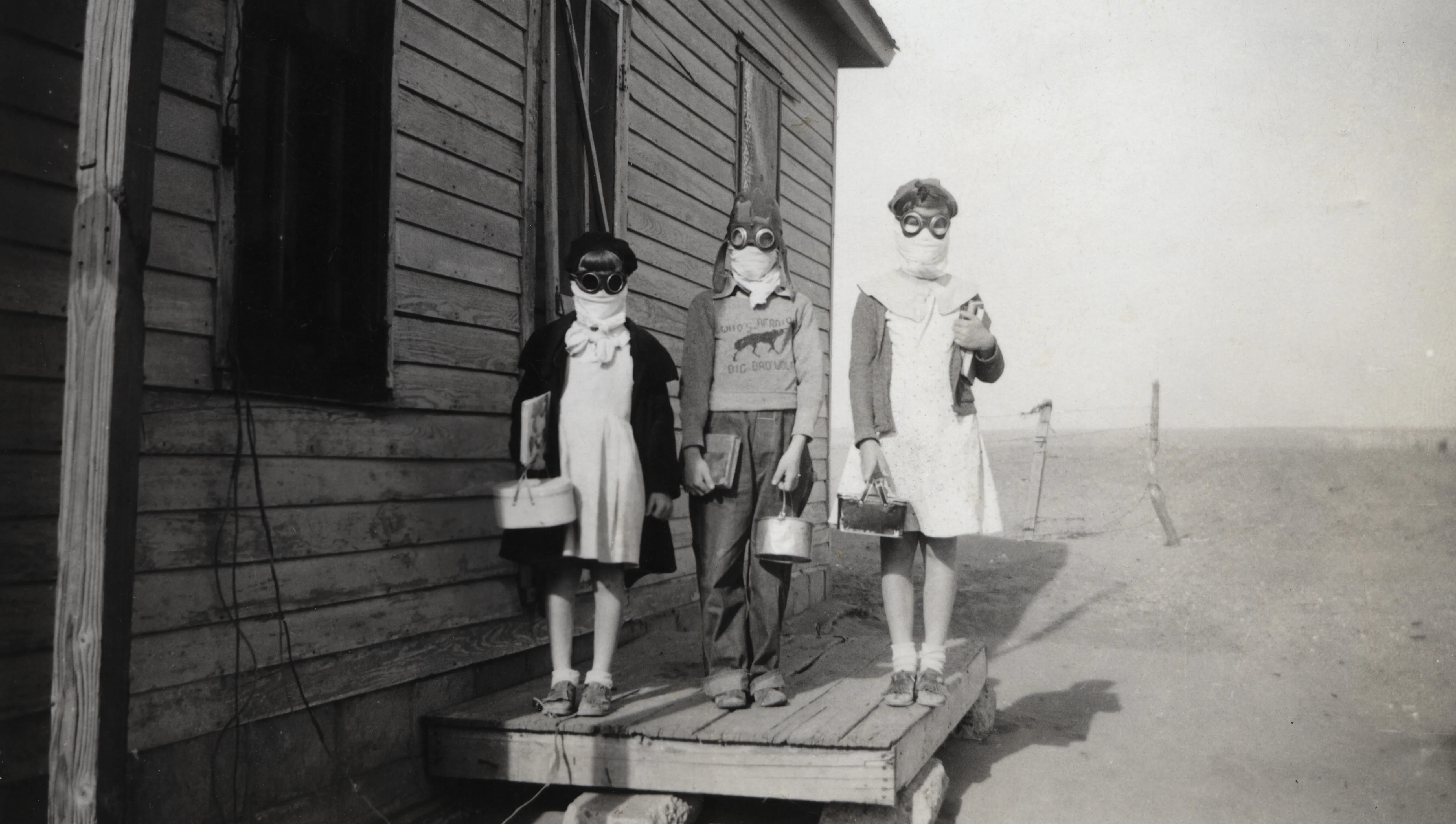
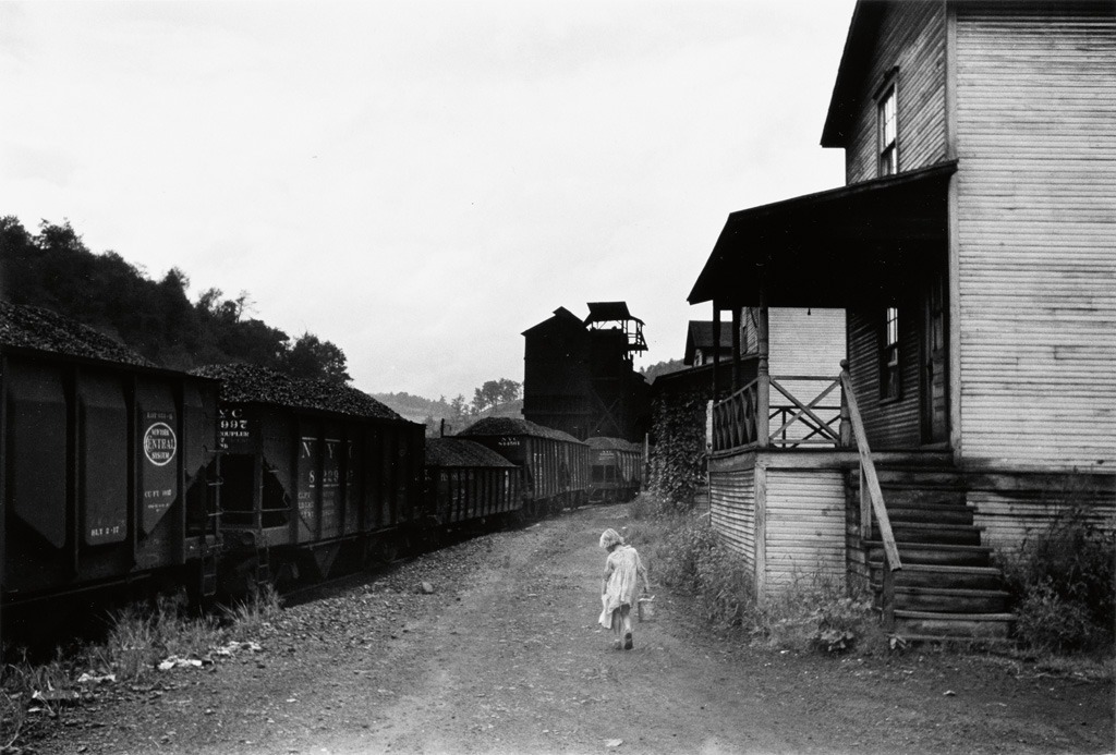
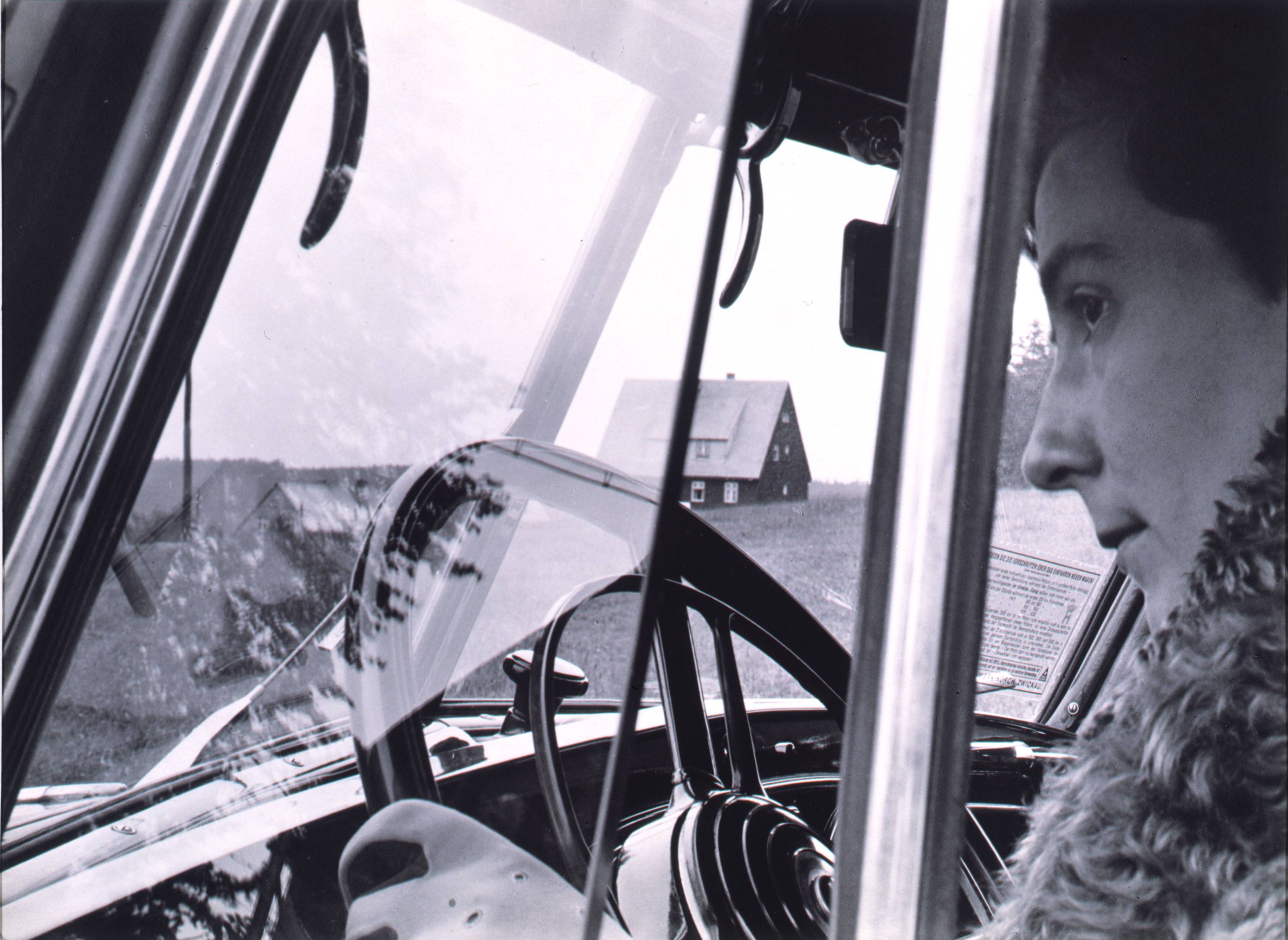
I see it in Adger’s Icarus motifs, like the one in this splendid photograph, snapped circa 1970. It captures the two subjects that feature most frequently in Adger’s work: the first an invitation to the sublime and the second its perilous journey. The (N)atural and the (P)olitical.

Adger is cofounder of the Kamoinge Workshop. Initially directed by Roy DeCarava, the workshop created “a mosaic of the Black experience,” says Deborah Willis, and enriched the Black Arts Movement. With every image, it undermined the media’s depictions of the Black diaspora before the Civil Rights Movement.

Adger’s work belongs also to the Black spiritual traditions that raised to the level of art a resilience in the key of E blues.

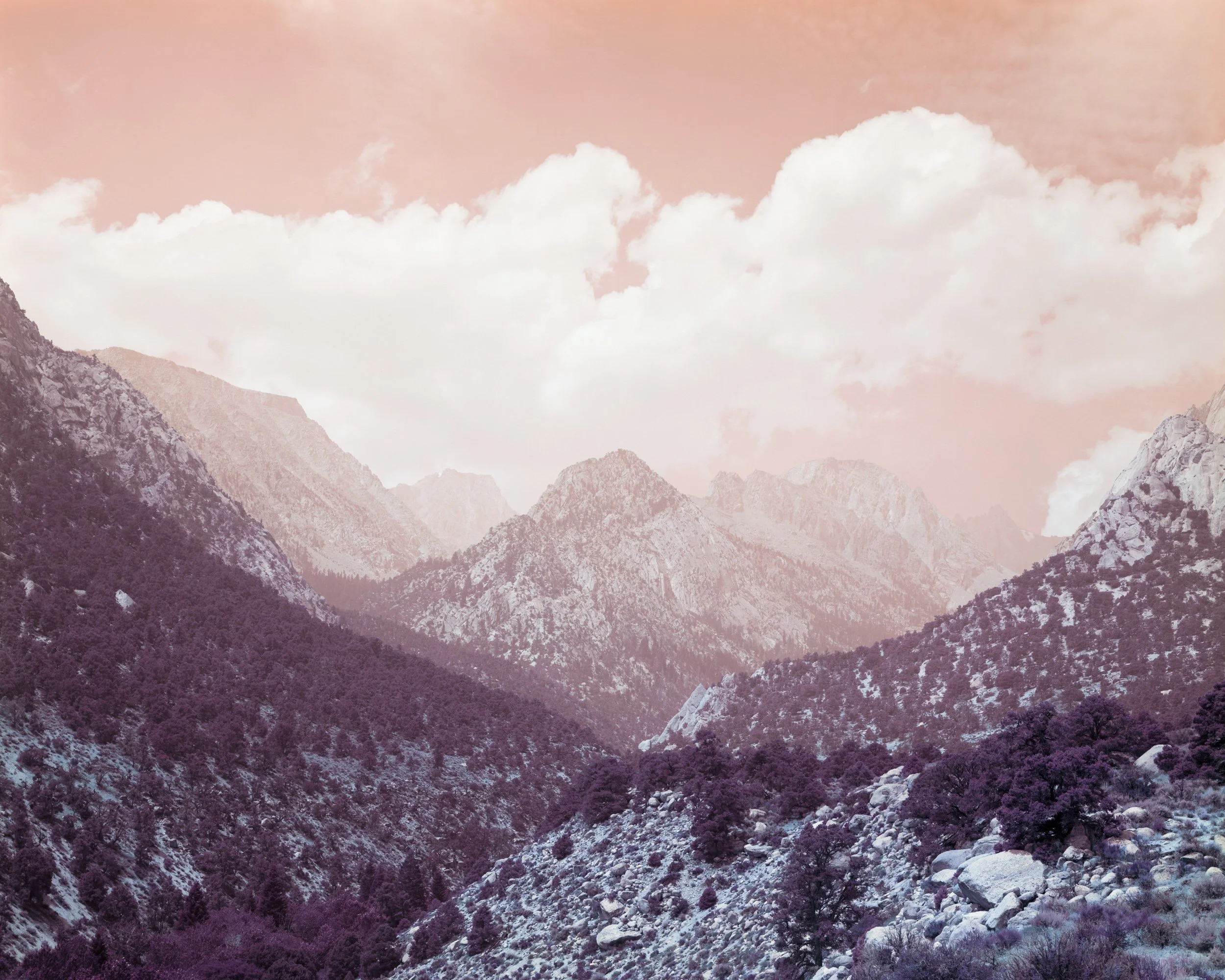
That’s the perilous journey. Then there’s Adger’s sublime odes to (N)ature. The unflinching lens of the journalist turns itself over to the transcendental, third-eye, earth-magic wonder that hypnotized the sixties.

The Adger I’ve seen on YouTube and in pictures wears a cocked beret and a big, brushy mustache, much like the one Gordon Parks wore. Eyes: amused, as if there were something comical about this whole business of existence, that any of it could be, at all—the camera, the sky, the wrinkle in the water, a word spoken aloud, himself, alive, facing us. Something Reinhold Niebuhr once wrote occurs to me here: “To meet the disappointments and frustrations of life, the irrationalities and contingencies with laughter, is a high form of wisdom. Such laughter does not obscure or defy the dark irrationality. It merely yields to it without too much emotion and friction.” Maybe that.

Or, you know, maybe it’s just Adger.
That’s the idea we kept coming back to as we put together this new book. Adger Cowans is an artist with an elated interior, and it was a stroke of luck for me that Cowans and Steve Albahari recorded a series of interviews in which that elation broke free of the conversation. Phrases like “the ethers,” “all that dancing,” “possessed,” “makes visible,” “shooting stars,” and “imbue my spirit” took on a meaning all their own, detached and intriguingly cohesive. This poetic improvisation—this jazz—makes Cowans’ art what it is. That’s why I decided to translate those interviews into erasure poems for this book. Erasure poems are about discovery and reclamation. They sift the grit of everyday life for gems overlooked. That’s what Cowans’ photography does.
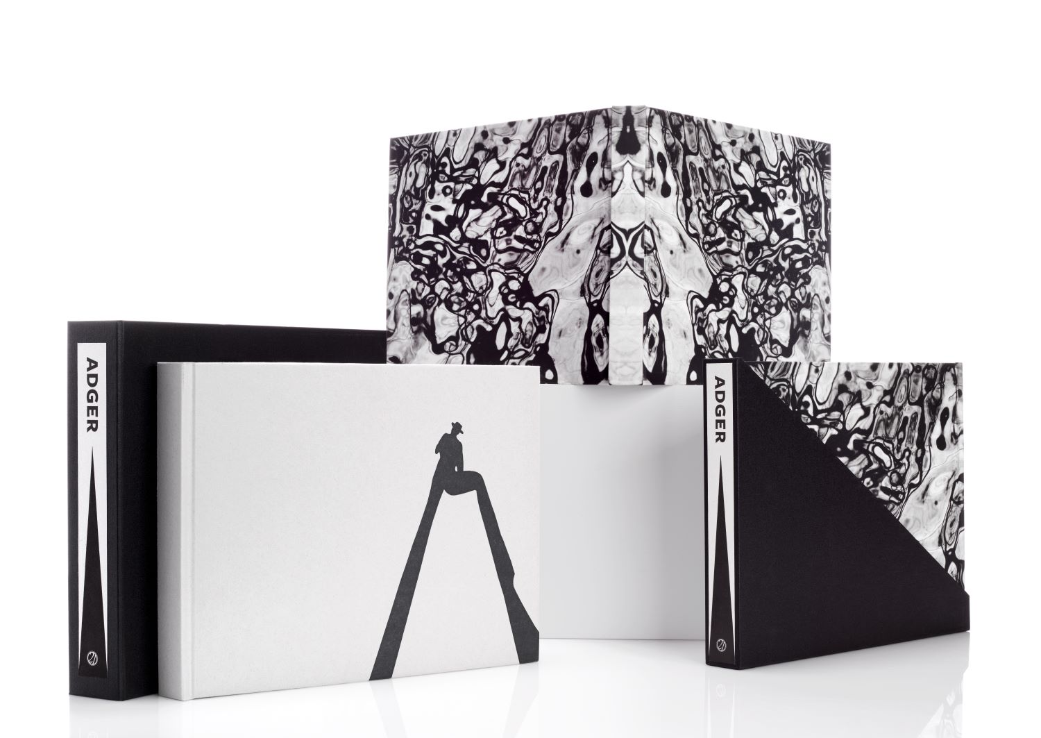
We used black-inked paper, leaving a selection of Adger-words in white peregrinations across the page. Seventy plates. Seventy. All bound and tucked into a half-sleeve that fits easily on any bookshelf.
Of the 630 copies produced, 530 belong to the slipcased trade edition (what you see in the images here), and the remaining 100 have been boxed and numbered for the special edition. Labels for the slipcases and boxes for both editions were printed letterpress on Twinrocker paper by Art Larson at Horton Tank Graphics. The Twinrocker paper was handmade by Travis Becker and the special edition comes with two platinum prints, each printed on Arches Platine by Martin Axon. The covers and interiors of both editions feature unique illustrations by Cowans himself. Suzanne Salinetti at Studley Press handled the distinctive black-on-black printing of this book (a feat never to be reproduced by Studley Press). The typography, by Crissy Welzen, is in Freight Sans. Bindings and slipcases were made by the team at Roswell Bookbinding. Pam Clark managed production across five states, and the venture in its entirety was overseen and directed by the publisher, Steve Albahari.
This is the first time 21st Editions has invested its efforts and resources into a widely accessible limited edition. The introductory price of the trade edition is $125, and the special edition, signed by all 11 contributors, is $1200 and comes with 2 signed platinum prints.
To order your copy, visit https://www.21steditions.com/shop.
To view more images of the book, click here. And for more 21st Editions and Prints, check out our collection at 21steditions.com.


